Turbomilk is a Russian company that does visual interface design. We create icons, characters, illustrations and interface design for applications. We also make web design packed with all modern web technologies. We deal with companies of all sizes from all over the world.


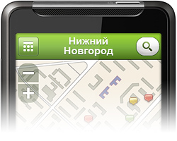
interfaces 2GIS Mobile
Mobile version of city information reference systemAndroid | Mobile applications

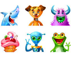
characters Illustrations for Boonex
Cheerful little fellows as illustrations for the siteWeb 2.0 | Web portal | Social Network


interfaces 2GIS Mobile
Mobile version of city information reference systemAndroid | Mobile applications
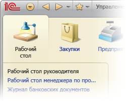
interfaces 1C:Enterprise
Interface of application intended for automation of enterprise activitiesWindows | Finances
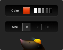
interfaces Interface for Iconza
Interface of web application with customizable iconsWeb 2.0 | Startup
characters Illustrations for Boonex
Cheerful little fellows as illustrations for the siteWeb 2.0 | Web portal | Social Network


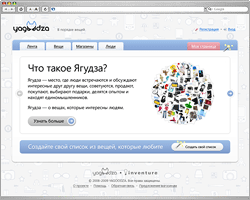
web_sites Yagoodza
А fancy social network for those in love with thingsWeb 2.0 | Web portal | Social Network


What’s new? RSS
- journal Wallpaper and icons for Alfa-Bank
- journal Characters Gallery
- identity Bingo.ru
- cookbook How we came up with and drew origami logos for LondonClasses
- icons Qt
- cookbook Exporting design comp from AI to PSD the right way: part 2 – useful tips
- characters Sinbad
- cookbook How we drew a character for Sindbad
- interfaces 2GIS Mobile
Articles
How we came up with and drew origami logos for LondonClasses
Exporting design comp from AI to PSD the right way: part 2 – useful tips
How we drew a character for Sindbad
Exporting design comp from AI to PSD the right way
Journal
Wallpaper and icons for Alfa-Bank
Alfa-Bank decided to please its clients, partners and employees with beautiful computer wallpaper and icons and approached us with this task. “Alfa means first”, — we thought and decided to devote the illustrations on the wallpapers to the trailblazers in various areas of human activity.
Read more →
We are very proud of our Blog!


Follow @turbomilkcom
@turbomilkcom